System Wide Standards
This document is the central reference to the basic concepts, features and standards of the system.
Look and feel. The look and feel of the pages may be altered when the product is implemented. Refer to Custom Look and Feel Options for details about how to accomplish this. Customizing the look and feel of the product means that colors may be changed, different text fonts may be used, text may be made bold, bigger, etc. The information provided below represents only the delivered product.
Contents
This section serves as a central reference to the basic building blocks of all pages used in the system.
Contents
Characteristics Common to All Pages
Components That May Appear In The Object Display Area
Characteristics Common to All Pages
The following is an illustration of the various areas that appear on every page.
The Object Display Area, which typically contains the heart of the page, has been excised from this illustration.
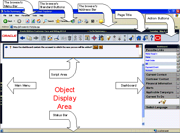
The following points describe all of the components on the above page.
Browser Specific Elements
The system does not have control over the following browser-specific functions:
· The Menu bar
· The Standard Buttons bar
· The Address bar
· The Status bar
Please refer to your browser’s documentation for instructions describing how these items work.
Page Title
The system’s Page Title is the dark blue line at the top of the page. The Page Title consists of the following:
· The name of the product
· The name of the page
· The day of the week
· The date
Action Buttons
The topics in this section describe the buttons that appear in the system’s action bar.
Contents
Business Process Assistant Button
 Back Button
Clicking the go back button returns you to the previous page that you accessed within the session. You may press Alt-B rather than clicking this button.
This button will be dim when there is nothing to go back to (e.g., when you first start the system).
Under unusual circumstances, when you return to a page, it may appear different from when you left it. This only happens if you use a “special” button to initially open a page and that button caused special defaulting to take place. If you leave the page and use the back button to return, the defaulted data may not be there.
 Recent
Pages Button
Recent
Pages Button
Clicking the recent pages button causes a list of the last pages you worked on to appear (the oldest pages appear at the bottom of the list). You may click on an entry in the list to return to a page. When you do this, all pages above it are removed from the list.
This button will be dim when there are no recent pages to go back to (e.g., when you first start the system).
 Forward Button
If you used the back button to return to a page, you can click the forward button to return to the original page that was displayed when the back button was clicked. You may press Alt-G rather than clicking this button.
This button will be dim when there is nothing to go forward to (e.g., when you first start the system).
Under unusual circumstances, when you return to a page, it may appear different from when you left it. This only happens if you use a “special” button to initially open a page and that button caused special defaulting to take place. If you were to leave this page (using the back button) and then return to it using the forward button, the defaulted data may not be there.
 Save Button
Clicking the save button saves any changes that you’ve made on the database. You may press Alt-S rather than clicking this button.
This button will be dim when you have not changed the object being displayed on the page (e.g., this button will be dim when you first display a premise). This button will be enabled when:
· You enter a page in add mode and values are defaulted into fields.
· You make changes to an object after it is displayed (note, you must tab or click out of the field before the button becomes enabled).
 Refresh Button
Clicking the refresh button refreshes the page with the last saved version of the object being displayed in the page. You would use this button if you wish to discard the changes that you’ve made to an object. You may press Alt-R rather than clicking this button.
 Clear Button
Clicking the clear button clears the currently displayed object from the page. You would use this button when there is an object displayed in the page and you want to clear the input fields (in preparation of adding a new object). You may press Alt-C rather than clicking this button.
 Duplicate Button
Clicking the duplicate button creates a duplicate of the object being displayed. Before the new object is added to the database, a window appears asking you to enter the unique identifier of the new object. When you click OK, the system creates the record by copying the original record. It may be helpful to think of the duplication functionality as the equivalent of Word’s “save as” functionality.
Permission to duplicate ancillary information is sometimes requested. As described above, when you click the duplicate button, you are prompted to supply the unique identifier of the new object. When you attempt to duplicate sophisticated objects (e.g., user groups), you may also be asked if you also want to duplicate ancillary information. For example, if you duplicate a user group, you will be asked to supply the ID of the new user group AND you will be asked if all users in the original user group should be linked to the new user group.
You may press Alt-D rather than clicking this button.
This button will be dim as follows:
· Duplication is not supported for the object.
· You have made changes to the object without committing the changes to the database (by clicking the save button). You must either save the changes or discard the changed (by clicking the refresh button).
 Delete Button
Clicking the delete button deletes the object on which you are working from the database. Before the object is deleted, a warning is presented asking for a confirmation.
This button is disabled when you cannot delete the object. Not all transactions have the capability to delete an object; the delete capability is related to the business impacts of such an action. In some transactions the delete button is enabled for some scenarios and disabled for others. For example, you may not be able to delete a record if it is in a certain status.
If you make a change to an object and do not save the changes to the database, you cannot delete the object until you either save the changes or refresh the object with the contents on the database.
Before you delete an object, the system verifies that the object is not referenced anywhere in the system. If it is, you cannot delete it. For example, if you attempt to delete a user, the system ensures this user has not been referenced on a user group or on an audit trail, etc.
Warning! A timeout situation could occur as the system attempts to verify the use of the deleted object if the object is referenced in many places AND involves large volumes of production data. If this timeout situation occurs, you will have to work with your database administration group to delete the offending object.
 Previous
Item Button
Previous
Item Button
This button is only enabled if:
You used a search page to display an item, and
There exists at least one other item in the search results ABOVE the item you selected
For example, if you enter search criteria of Smith on the User Search page, you might see the following results:
· Smith, Albert
· Smith, Peter
· Smith, Zane
If you select Smith, Peter, Peter’s user information is displayed on the User page. If you click this button, Smith, Albert will be displayed. In addition, because Smith, Albert is the first entry in the search results, this button will become disabled.
You may press Alt-P rather than clicking this button.
 Next Item
Button
Next Item
Button
This button is only enabled if:
You used a search page to display an item, and
There exists at least one other item in the search results BENEATH the item you selected
For example, if you enter search criteria of “Smith” on the User Search page, you might see the following results:
· Smith, Albert
· Smith, Peter
· Smith, Zane
If you select Smith, Peter, Peter’s user information is displayed on the User page. If you click this button, Smith, Zane will be displayed. In addition, because Smith, Zane is the last entry in the search results, this button will become disabled.
You may press Alt-N rather than clicking this button.
 Menu Button
Clicking the menu button presents a list of menu choices. The list is dependent upon your environment, but typically includes Main and Admin. Selecting one of the menu choices causes that menu to appear in the menu area. You need only click this button if you need to navigate to a page that doesn’t appear on the current menu.
You may press Alt-M rather than clicking this button. You may press Enter rather than clicking on a menu name.
 Control
Central Search Button
Control
Central Search Button
This functionality is not available in every product.
Clicking the Control Central Search button returns you to the Control Central page ready to search for a new customer / premise. You can also press Alt-L to perform this function.
 Account
Information Button
Account
Information Button
This functionality is not available in every product.
Clicking the Account Information button transfers you to Control Central - Account Information page. The last person / account / premise that you accessed in Control Central is displayed. You can also press Alt-I to perform this function.
 To Do List Button
Clicking the To Do button transfers you to To Do Summary. You can also press Alt-X to perform this function.
 Previous
To Do Button
Previous
To Do Button
This button is only enabled if you selected an entry either on the To Do List page or the To Do Search page, and there exists at least one other entry in the list ABOVE the entry you selected.
For example, assume you are working on a To Do list that has the following bill segment errors:
· Smith,Albert – Rate is invalid
· Smith,Peter – Meter read cannot be found and not allowed to estimated
· Smith,Zane – A price cannot be found for kWh
If you select the To Do entry for Smith,Peter, the bill segment with the invalid rate is displayed on the Bill Segment page. If you click the Previous To Do button, Smith,Albert is displayed. In addition, the Previous To Do button becomes disabled because Smith, Albert is the first entry in the list.
You can also press Alt-Y to perform this function.
Clicking the Previous To Do button opens the transaction. This button opens the transaction indicated in a To Do entry’s message (not to the To Do entry). For example, if a To Do entry’s message indicates a problem with a payment event, you are taken to the payment event transaction.
Warning! When you drill down on a To Do entry from the To Do List page, the system automatically changes the status of the entry to Being Worked. If you use this button to scroll through this list, the system does NOT change the To Do entry’s status. If you want to change the status of these entries, you must return to the To Do List. On this page, you can select a multitude of entries and change their status with a single user-interface action.
 Next To Do
Button
Next To Do
Button
This button is only enabled if you selected an entry either on the To Do List page or the To Do Search page, and there exists at least one other entry in the list BENEATH the entry you selected.
For example, assume you are working on a To Do list that has the following bill segment errors:
· Smith,Albert – Rate is invalid
· Smith,Peter – Meter read cannot be found and not allowed to estimated
· Smith,Zane – A price cannot be found for kWh
If you select the To Do entry for Smith, Peter, the bill segment with the invalid rate is displayed on the Bill Segment page. If you click the Next To Do button, Smith, Zane is displayed. In addition, the Next To Do button becomes disabled because Smith, Zane is the last entry in the list.
You can also press Alt-Z to perform this function.
Clicking the Next To Do button opens the transaction. This button opens the transaction indicated in a To Do entry’s message (not to the To Do entry). For example, if a To Do entry’s message indicates a problem with a payment event, you are taken to the payment event transaction.
Warning! When you drill down on a To Do entry from the To Do List page, the system automatically changes the status of the entry to Being Worked. If you use this button to scroll through this list, the system does NOT change the To Do entry’s status. If you want to change the status of these entries, you must return to the To Do List. On this page, you can select a multitude of entries and change their status with a single user-interface action.
 Current
To Do Button
Current
To Do Button
This button is only enabled if you have selected an entry on the To Do List page, the To Do Search page or you have requested the next To Do via the Current To Do zone. When pressed, you are transferred to the To Do entry maintenance page where you can complete the entry, re-assign the entry, add notes to the entry, etc.
You can also press Alt-K to perform this function.
 Business
Process Assistant Button
Business
Process Assistant Button
Clicking the business process assistant (BPA) button opens a new window where a script can be selected to guide you through the steps in a business process). You can also press Ctrl+Shift+S to evoke this function. This button “glows” while a script is executing. If you hover the mouse pointer over the glowing BPA button, a tool tip containing the name of the script displays.
 Home Page
Button
Home Page
Button
Clicking the Home Page button transfers you to your home page. Your home page is defined on your User Preferences. You may press Alt-O rather than clicking this button.
 My
Preferences Button
My
Preferences Button
Clicking the My Preferences button causes a new window to appear in which you can change your user preferences.
 Help Button
Clicking the help button causes context-sensitive help to appear in a new browser window. You may press Alt-F1 rather than clicking this button.
 About Button
Click the about button to display a window that describes the current and release information for your version of your product.
The about box shows a variety of information including:
· Who the system is licensed to
· The user ID who is logged on
· The release ID of the product
· The release ID of the framework used to construct the product
· The release ID of any customer specific modifications (this comes from the installation record)
Your implementation can add additional information to this window by populating user exits on the browser and/or the application server (CIPZENVP is the name of the application server program to which user exit code can be added). Please speak to the product customer support for more information if you need to take advantage of this feature.
 Next Call
Button
Next Call
Button
This functionality is not available in every product.
Clicking on the next call button opens Control Central page for the next customer in your queue. This button is only available if the installation options indicate that you have integrated the system with some type of “next caller” software such as CTI/IVR.
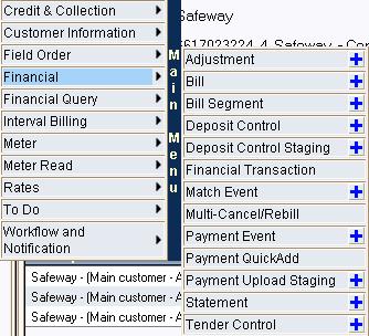
Menu Area
The Menu Area contains a menu that is used to navigate to the various pages within the system. Click anywhere on the menu bar to cause the menu to appear. Refer to Menu Bars for more information.
Switching to a different menu. You can toggle the menu that appears in the Menu Area by clicking the Menu Button and then selecting the desired menu.
Object Display Area
The Object Display Area contains the details of the object(s) currently being viewed or maintained. For example, if you display a portal, its zones are displayed in this area.
Refer to Components That May Appear In The Object Display Area for a description of the various components that may appear on objects displayed in this area.
Dashboard Area
The dashboard is a portal page that contains zones. These zones appear regardless of the object being displayed in the Object Display Area. Refer to Dashboard Portal for a description of these zones.
User configurable. Every user has control over the zones that appear in their dashboard. Refer to Portal Preferences for more information about how a user can customize the contents of the dashboard.
Script Area
When a script is initiated, the object display area shifts down to make room for the script area.
The information in the script area takes you through the steps in the selected business process (note, your implementation team controls the information that appears in the script area).
Refer to The Big Picture Of Scripts for more information about scripts.
Components That May Appear In The Object Display Area
The topics in this section describe the various components that may appear in the object display area.
Contents
Push Button
The diagram below illustrates an example of push buttons.
Initiate the action described by clicking the appropriate button. Press ALT-F1 for an explanation of the button function.
Buttons are dimmed when they cannot be selected. In the above example, the Freeze and Cancel Frozen buttons are dimmed.
Check Box
The following is an example of a check box:
Check Boxes control individual choices that are either turned on or off. When the choice is turned on, the box has a check in it. When the choice is turned off, the box is blank. The state of the box can be toggled on or off by clicking on the box with the mouse. In the above example, Protect Bill Cycle is not selected. In the following example, Protect Bill Cycle is selected.
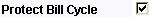
Text Box
The following is an example of a text box:
Text boxes are areas into which you can type information. The Left and Right arrow keys can be used to move the insertion point in the text box. The CTRL Right and Left arrow key combinations can be used to move the insertion point to the next and prior word in the text box. The Home and End keys can be used to move the insertion point to the beginning and end of the text box.
If a text box holds a numeric field, a value of zero will be defaulted if the field is left blank.
If the field for the text box is a large field the text box may be configured to enable scrolling and an Expanded Edit icon appears adjacent to it.
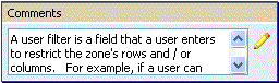
Additional capabilities are provided for display and editing data in text boxes configured this way.
· If the field contains more text than is visible on the screen, hover the mouse pointer over this type of text box to cause a pop-up to appear displaying the full text. The text in the pop-up may be selected to facilitate copying its text to the clipboard.
· If you click the Expanded Edit icon, an editable pop-up window appears. If the field is not protected as a result of business rules for the page, you may modify the text in this window.
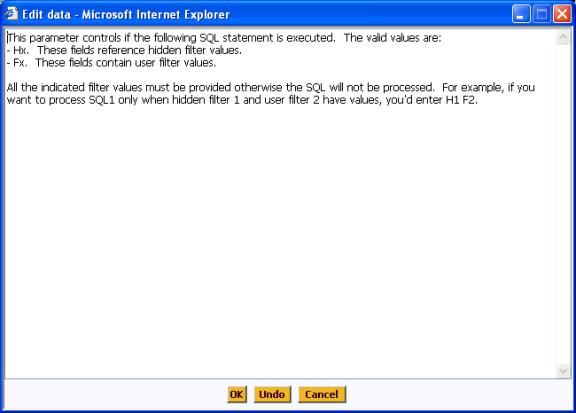
Click OK to close the window saving the changes entered.
Click Undo to refresh the text to what it was before you started making changes.
Click Cancel to close the window without saving any changes you may have entered.
Date Only Field
The following is a date field where time is not required (refer to Date & Time Field for an example of date field that also requires a time).
Date fields are special Text boxes that can only accept and display dates.
The format in which dates are displayed (e.g., 12/25/2002 versus 25/12/2002) is defined on the user’s display profile.
While dates are always displayed in a single format, a user may use a variety of formats when entering a date. For example, if a user’s display profile indicates dates are displayed as MM/DD/YY, dates may be entered using ANY of the following formats: MMDDYYYY, MM-DD-YYYY, MM/DD/YYYY, MMDDYY, MM-DD-YY or MM/DD/YY. If you use any of the last 3 formats, the century will be defaulted as follows:
· If the year is less than 80, a century of 20 will be defaulted.
· Otherwise, a century of 19 is defaulted.
If you double-click or press the space bar while in a date field, the following page appears.
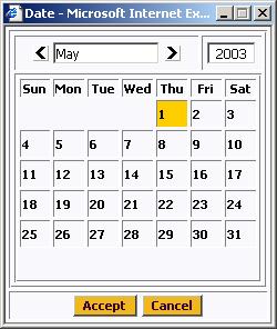
If the date field was blank, the current date is highlighted when the window first appears. If the date field contained a date, it is displayed.
You can double-click the desired date OR you can click it and click Accept to close the date window and populate the date field.
Date & Time Field
When both date and time are required, the input fields typically look as follows:
The date must be entered in the format described above.
The format in which time is displayed (e.g., 1:23PM versus 13:23) is defined on a user’s display profile.
While time is always displayed in a single format, a user may use a variety of formats when entering a date. For example, if a user’s display profile indicates time is displayed as hh:mma, time may be entered using ANY of the following formats:
· HH:MMZZ, where HH is the hour, MM is the minute and ZZ is AM or PM. The ZZ is optional and will default to AM if not entered.
· NNNNZ where NNNN is the hour and minute and Z is A (AM) or P (PM). The Z is optional and will default to A if not entered.
Examples:
· Entering 123 will result in 1:23AM.
· Entering 456P will result in 4:56PM.
If you double-click or press the space bar while in a date or time field, the following page appears.
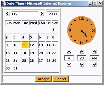
Select the date and use the toggle buttons (or enter) the time and then click Accept to populate the original fields.
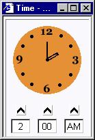
Time Only Field
On rare occasions, there are independent time fields that are not tied to a date. The time must be entered in the format described above. If you double-click or press the space bar while in a time field, the following page appears.
Currency Field
The following is a currency field. Currency fields hold a currency amount:
Currency fields are special text fields that can only accept and display currency amounts. Currency amounts may be entered with or without decimal places.
The format in which currency is displayed (e.g., 1,000.19 versus 1.000,12) is defined on a user’s display profile.
Dropdown List Box
A dropdown list box is a text box with an attached, integrated, interdependent list. It is used to allow selection of an item from a list while displaying the currently selected item in the text area.
There are two ways to select an item from a drop down when it is not expanded. If you type in the first letter of an option, the option will be selected (if multiple options have the same first letter, they will toggle in the box). Alternatively, you can use the arrow keys to scroll through the choices.
To expand the list select the dropdown's down arrow. One row appears for each item that can be selected. Again you can type in the first letter of an option or use the arrow keys to scroll through the choices.
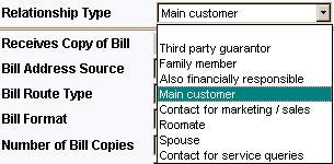
Select an item by clicking it. The box closes and the selected item is displayed in the dropdown field.
Caching dropdown values. Please be aware that dropdown values are typically cached on the web server in order to reduce database access for this type of static information. Refer to Caching Overview for information about the cache and how to clear it if recently added values don’t appear in a dropdown.
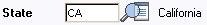
Go Look Button
The button with the magnifying glass to the right of the text input field is an example of a “go look” button:
“Go look” buttons are used to tell the system to find a value on the database that matches the data entered in the adjacent input field. You can have the system search for an item that matches the data you entered using any of the following methods:
· If you press Enter while in a field with an adjacent search button, the system assumes you want to search for the value entered and pre-populates it in the search window’s search criteria. In the above example, when the Enter key is pushed, the system attempts to find a state with a code equal to the input value. If a unique match can be found, the system automatically populates the field with details that correspond to the record found. If a unique match cannot be found (either no matches or multiple matches), a search page opens containing selectable items.
· If you click the search button rather than press Enter, the system assumes you want to use the search criteria on the search page and therefore does not pre-populate the search criteria with the value of the field.
· If you tab out of a field, the system looks for a value that exactly matches what you entered. If it cannot find such a value, the search dialog will not be presented.
When an item is selected in the search page, the search page closes and the input field is populated with the value selected. Note: an item can be selected in the search page by clicking on a specific row.
Sorting on columns in the search grid. You may click on the column heading of columns in a search grid to cause the contents of the grid to be sorted. Refer to Sorting Functionality for more information.
Search Button
The button with the binoculars to the right of the text input field is an example of a search button:
Search buttons are used to tell the system to try and find a value on the database. You can have the system search for an item using any of the following methods:
· If you click the search button, the system invokes the search.
· If you press Enter while in a field with an adjacent search button, the system assumes you want to search for the value entered. If a unique match can be found, the system automatically selects it and closes the search window. If a unique match cannot be found (either no matches or multiple matches), the search page shows the results.
When an item is selected in the search page, the search page closes and the input field / page is populated with the value selected. Note: an item can be selected in the search page by clicking on a specific row.
Context Menu Button
The button containing the menu icon to the right of the Premise label is an example of a “context menu” button:
Context menu buttons exist to help you navigate to other pages with data pre-displayed. For example, when you click the Premise context menu button, a pop-up menu similar to this appears:
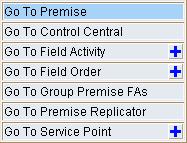
Each menu item represents a different page. When you select a menu item, the system opens the respective page and passes to it the ID of the related object. For example, if you were to select Go To Service Point from the above menu, the system would open the Service Point page and pass to it the ID of the associated premise.
If the menu item has a  button to the far right, this means there are
two ways to transfer to the associated page:
button to the far right, this means there are
two ways to transfer to the associated page:
·
If you click the button, you will be transferred to the
associated page in add mode. When the
page appears, you will typically find that the system has filled in fields
related to the context menu’s related object.
For example, if you choose the Go To Service Point (in add mode) option,
the service point page will be opened with the premise ID already filled in.
·
If you click anything other than the button, you will be transferred to the
associated page in update mode. When
you do this for some menu items, you’ll find that a search list appears (rather
than the maintenance page). For
example, if you choose Go To Service Point (not in add mode), and the premise
has multiple service points, the service point search page appears with a list
of the premise’s service points pre-populated.
To update one of the service points, simply select it on the search
page.
Different context menus exist for each of the major objects in the system. For example, the context menu for Premise contains premise-oriented menu items, whereas the context menu for Account contains account-oriented menu items.
Go To Button
The icon containing the “arrow on a page” is a “go to” button:
When a go to button is clicked, you are transferred to the page associated with the related object.
More Info Button
The icon containing eyeglasses in front of a window is a "more info" button.
When a more info button is clicked, a pop-up window containing additional information is displayed. In some cases, this additional information may be modifiable.
UI Map Help Icon
The icon containing a question mark in a speech bubble is a UI map help icon.
When a UI map help icon is clicked, a tool tip appears containing additional information. You may press Alt-F1 rather than clicking this icon.
Expanded Edit Icon
The icon containing a pencil is an expanded edit icon.
When an expanded edit icon is clicked, an expanded edit field appears for text area inputs.
Grid
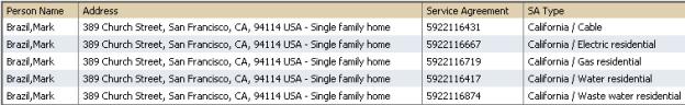
A grid is used to display one or more rows of information. Grids are used in search results, query pages, and some maintenance pages. For example, the following grid shows the service agreements linked to an account.
The topics in the section describe grid-specific functionality.
Contents
Horizontal and Vertical Scroll Bars
Horizontal and Vertical Scroll Bars
A grid may have vertical and/or horizontal scroll bars. Scroll bars allow you to view different sections of the grid by scrolling left / right / up / down. The scroll bars only appear if more data exists in the grid than what is currently visible.
Dynamic Height
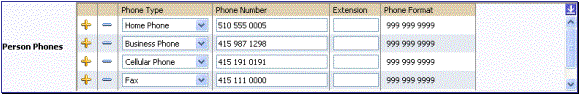
Sometimes the height of a grid isn’t sufficient to display a grid’s rows. When this occurs, a vertical scroll bar appears and an “expand button” appears above this bar. For example, the following grid is not high enough to show all of a person’s phone numbers:
If you want to view all of the person's phone numbers without using the vertical scroll bar, you can you click the expand button. When clicked, the height of the grid expands to show all rows in the grid:
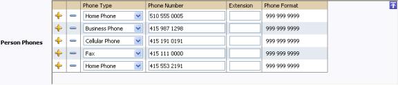
Notice, after the grid is expanded, the grid’s vertical scroll bar disappears and the button in the upper corner becomes a "collapse button". If you click the collapse button, the grid will return to its original height.
Another vertical scroll may appear. Clicking an expand button will cause a vertical scroll bar to appear in the object display area when the expanded grid causes the object display area to exceed its vertical height limitations.
Search grids. Expand all functionality is not available in search grids.
Sorting Functionality
Grids have a heading row that contains labels for the columns. By clicking on a column name, you cause the rows to be sorted in the order of the selected column. By clicking on a column more than once, you cause the rows to be sorted in REVERSE order.
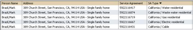
When you use the sorting functionality, the name of the column contains an icon that indicates if the rows are displayed in ascending or descending order. The following shows how the grid looks after clicking on the SA Type column (notice the icon in the column name).
Sorting on dropdown values. If you attempt to sort a column that contains a drop down value, the information is sorted in the order of the unique identifier associated with the drop down value, not the description you see on the screen. For example, if you sort on a column containing unit of measure, the information will be sorted in the order of the unit of measure code, not the description that appears in the drop down. This means that the resultant sort will appear incorrect and therefore we discourage you from doing this.
Get More Functionality
Grids that can potentially contain a large number of rows have special processing that we refer to as “get more” functionality. We’ll use an example to explain – consider the grid that contains all payments that have been added to a cash drawer. By the end of the day, this grid could contain hundreds of rows (one for each payment remitted during the day). Rather than show every payment in the grid, the system retrieves the first X payments (where X varies from grid to grid, and from release to release) and appends a button to the bottom of the grid as illustrated below:
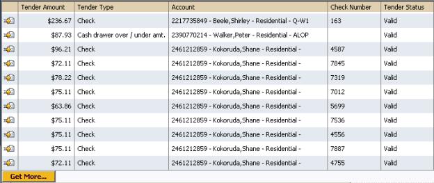
When you click the Get More button, the system appends the next X rows to the bottom of the grid.
The absence of a "get more" button. If no button appears at the bottom of the grid, this means you are seeing all of the rows.
Search grids. The Get More function is not available in search grids.
Editable Grid
Some grids contain display-only information; other grids can have their contents changed. The contents of this section describe the various ways an editable grid can be maintained.
Contents
Using Add and Remove Buttons
The rows in most editable grids are prefixed by  and
and buttons:
You may change the individual cells of editable grids as desired.
If you click the button, a
new row will be inserted. You may press
Alt-Insert rather than clicking this button.
If you click the button, an
existing row will be deleted. You may
press Alt-Delete rather than clicking this
button.
Reminder. When you insert new rows into a grid, the system does not add them to the database. You must click the Save button to commit the entire object to the database.
Using Left and Right Arrows
Occasionally, rows can be added to an editable grid by transferring rows from another grid. The contents of this section describe how to use this functionality.
Contents
Adding Rows Using The Left Arrow
Removing Rows Using The Right Arrow
Adding Rows Using The Left Arrow
A new row can be added to the following editable grid (the
grid on the left) by clicking the button of
the desired row in the grid on the right:
button of
the desired row in the grid on the right:

When thebutton is
clicked, the row is transferred from the grid on the right to the grid on the
left. This change will not be committed
to the database until you save the object being maintained.
Removing Rows Using The Right Arrow
A row can be removed from the following editable grid (the
grid on the left) by clicking the button on
the row to be removed.
button on
the row to be removed.
When thebutton is
clicked, the row is transferred to the grid on the right. This change will not be committed to the
database until you save the object being maintained.
Using Up and Down Arrows
Occasionally, rows can be repositioned in an editable grid by clicking up and down arrows. The following is an example of such a grid:
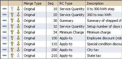
Notice the following about such a grid:
· The up arrow is dim in the first row. This is because it can’t be moved further to the top.
· The down arrow is dim in the last row. This is because it can’t be moved further down.
· The up and down arrows are usable in all other rows. Each time you click one of these arrows, the respective row is moved up or down one row.
Reminder. When you move rows into a grid, the system does not apply the change to the database until you click the Save button (which commits the entire object to the database).
Scrolls
When the number of fields in a row exceeds the number fields that can be comfortably shown on a horizontal plane, a scroll may be used rather than a grid. The following is an example of the scroll used to maintain the persons linked to an account:
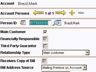
The object that is scrolling is demarcated by the and
images. In the above example, the
various persons associated with an account appear in the scroll.
Two numbers appear between the two arrows. The first number indicates the current entry’s position relative to the other entries in the scroll. The second number shows the total number of entries in the scroll. In the above example, the person being displayed is the first and only person linked to the account.
If multiple objects exist, you can click the and images to
scroll through the objects. You may
press Alt-left arrow and Alt-right
arrow rather than clicking on these buttons.
You may change the individual fields of an entry in the scroll as desired.
If you click the button, a
new entry is added to the scroll. For
example, if you did this in the above scroll, you could link another person to
the account. You may press Alt-Insert rather than clicking this button.
button, a
new entry is added to the scroll. For
example, if you did this in the above scroll, you could link another person to
the account. You may press Alt-Insert rather than clicking this button.
If you click the button, an
existing entry will be deleted. For
example, if you did this in the above scroll, you would remove a person from
the account. You may press Alt-Delete rather than clicking this button.
button, an
existing entry will be deleted. For
example, if you did this in the above scroll, you would remove a person from
the account. You may press Alt-Delete rather than clicking this button.
Reminder. When you insert new rows into a scroll, the system does not add them to the database. You must click the Save button to commit the entire object to the database.
Notebooks
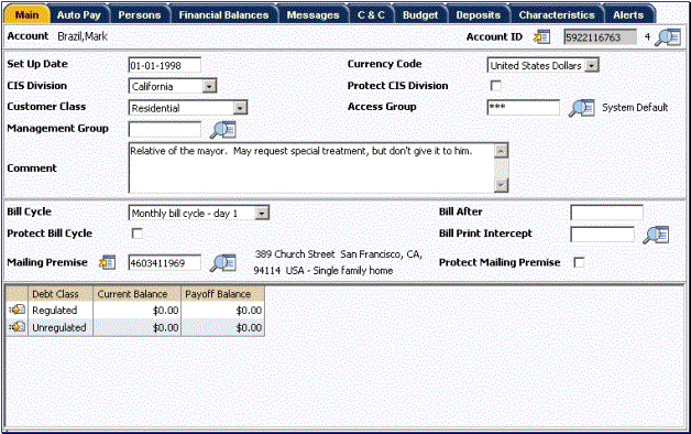
Notebooks are used when the object being displayed contains more information than can fit within the Object Display Area. Let’s use the example of the page that contains account information:
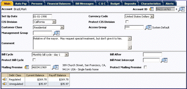
Notebook Example
Because the account object has more information than can fit within the confines of the object display area, multiple tabs appear across the top of the object display area. The names of the tabs describe the type of information that will be displayed in the page when the tab is clicked. For example, if you click on the Persons tab, the contents of the page show the persons linked to the account.
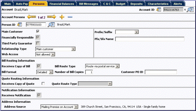
Notebook Example (After Persons Tab Is Clicked)
F2 and SHIFT-F2. Rather than clicking on a tab, you can press F2 or SHIFT-F2 to scroll through the tabs. F2 moves you through the tabs from left to right. SHIFT-F2 moves you through the tabs from right to left.
Alt-1 through Alt-9. When pressed, the tab page whose relative position corresponds with the number appears. For example, if you press ALT-3 on the above page, the Person tab will be displayed. If there are more than 9 tabs on a page, you must use the mouse or F2 / Shift-F2 to display a tab. Note well, the numeric keypad on your keyboard cannot be used to implement this function.
Returning to a page that contains a notebook. If you return to a page (by clicking the Back Button or the Recent Pages Button), the notebook will be positioned on the last tab that was opened.
Page versus Tab nomenclature. The documentation frequently refers to the contents of a notebook tab as a page. However, the page is really the entire collection of tabs.
Trees
Trees are used to illustrate complex relationships between objects. The following is an example of a page with a tree that is expanded:
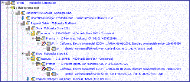
Tree Example
The following points describe how to use trees:
You can expand and contract the nodes in a tree by clicking on the icon that prefixes the node (you can also click the + and – button to expand and contract a node).
Expand all. If you press the Ctrl button while clicking on an icon that prefixes a node, all child nodes (and their children) expand.
You can click the context menu button to cause a context menu to appear. You can navigate to any of the pages that are presented on this menu. Refer to Context Menu Button for more information.
You can click on the information that appears in an underlined node to drill into the page in which the object is maintained. For example, if you click on the account information, you will be transferred to the Account – Main page.
Important! If you make changes after expanding a tree’s nodes (e.g., by drilling down on a Premise and changing the premise’s address), the tree will contract to the first node if you return to the page.
Nodes in trees fit into two broad categories:
· Information nodes. Information nodes highlight the existence of other data. For example, on the Control Central – Bill Payment Tree, a node exists to highlight the existence of new financial transactions that were created since the last bill was completed.
· Data nodes. Data nodes show information about objects in the system. For example, data nodes exist on the Control Central – Bill Payment Tree that show bills and payments.
You can click on the verbiage in a data node to drill down to a page in which the respective object can be seen in detail. Information nodes to not have this type of drill down capability. We visually differentiate between these two types of nodes by using special formatting on data nodes with drill down (they are blue and underlined).
Nodes that can contain a large number of rows have special processing (referred to as “get more” functionality). We’ll use an example to explain – consider the tree that contains an account’s bills and payments. Over time, this tree can contain many rows (one for each payment and bill linked to the account). Rather than show every row, the system retrieves the first X rows (where X varies from node to node, and from release to release). If more than X rows exist, a Get More button is appended to the node (appearing after the last row in the node). When you click the Get More button, the system appends the next X rows to the bottom of the tree. Note, if no Get More button appears at the bottom of a node, this means you are seeing all rows.
Accordion
Accordions are used when the data held in an object's rows does not comfortably fit into a grid.
Each row in an accordion has a "header" that summarizes a row's details. When you click on a header, the row expands to show the details. The following is an example of an accordion where all headers are collapsed (i.e., only summaries of the rows' details are shown):
An Accordion With All Rows Collapsed
When you expand a header, its details are exposed. For example, the following shows the same accordion after the third row is expanded:
An Accordion With A Row Expanded
You must expand to update. In order to update a row in an accordion, you must expand it.
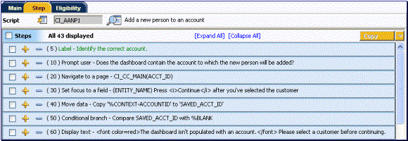
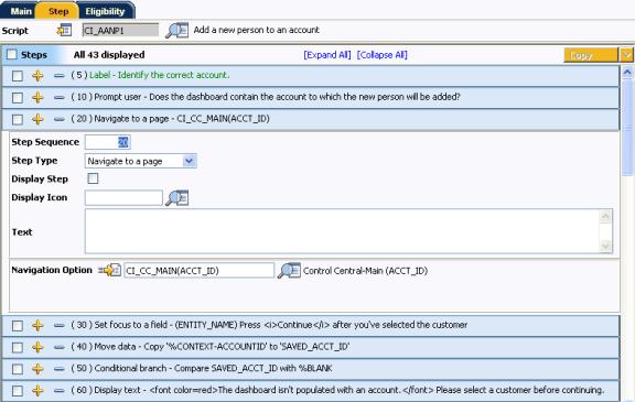
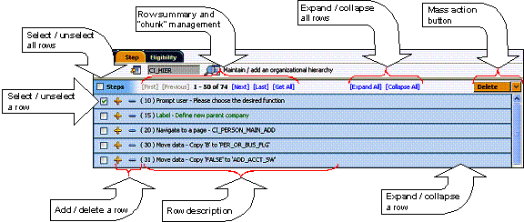
Accordions are rich in functionality. The following illustration will be used to describe how accordions work (FYI, this accordion is used to maintain the steps in a simple script).
The topics in the section describe how accordions work.
Contents
Row Summary and Chunk Management
Mass Action Button
Some accordions have "mass action" functionality. Mass action functionality allows you to perform a given action on one or more rows. For example, the above accordion allows use to delete the selected rows.
The mass action is enabled when at least one row in the accordion is selected. Clicking an action button causes the respective action to be performed on the selected rows. For example, if you click the above accordion's Delete button, all selected steps will be deleted from the script.
To see all of the possible actions on an accordion, press the down arrow adjacent to the button. Pressing the arrow causes a drop down to appear in which all available actions appear. When you select a row in the drop down, the mass action button's label changes accordingly. When you press the button, the action is performed.
Reminder. When you use the mass action button, the system does not change the database immediately. You must click the Save button to commit your changes.
Select / Unselect Rows
Before you can use an accordion's mass action button, one or more rows must be selected. There are two ways to select rows:
· Click the checkbox above the accordion's rows to select all rows. Clicking again will cause all rows to be unselected.
· Click the row's check box. Clicking again will cause the row to be unselected.
Row Summary and Chunk Management
At the top of an accordion you'll find a summary of its rows. The format of this information differs depending on the number of rows and the size of the accordion:
· If the accordion contains every row, a summary of the total number of rows is displayed.
· If the accordion contains a subset of rows, you are presented with a summary of the rows AND you are provided with options to display different "chunks" of rows.
· Click First to display the first "chunk" of rows (the size of a chunk differs depending on the accordion). This option is dimmed if the first chunk is in the accordion.
· Click Previous to display the previous chunk of rows. This option is dimmed if the first chunk is in the accordion.
· Click Next to display the next chunk of rows. This option is dimmed if the last chunk is in the accordion.
· Click Last to display the last chunk of rows. This option is dimmed if the last chunk is in the accordion.
Expanding and Collapsing Rows
The following points describe how an accordion's rows are expanded and collapsed:
· Click Expand All to expand every row in the accordion. Note, accordions that perform extensive processing during row expansion do not support this feature.
· Click Collapse All to collapse every row in the accordion.
· Click a collapsed row's description to expand the row.
· Click an expanded row's description to collapse the row.
Adding and Removing Rows
If an accordion's rows are prefixed withandbuttons,
you can add and remove rows from the accordion:
·
Click the button to
add a new row.
·
Click the button to
delete an existing row.
Reminder. When you insert or delete rows, the system does not add them to the database immediately. You must click the Save button to commit your changes.
Menu Bars
A menu bar is the bar appearing on the far left side of the browser. The topics in this section describe how to operate a menu bar.
Contents
Using the Menu to Navigate to Other Pages
Using the Menu to Navigate to Other Pages
When you click the menu bar, a menu appears:
You may press Alt-U rather than clicking on the menu bar. If you press Alt-U while the menu bar is exposed, it will close.
When you move the mouse pointer over the various menu items, different submenus appear (the Customer Information submenu is illustrated below).
Each menu item represents a different page. If the menu item has a button to the far right, this means there are
two ways to transfer to the associated page:
·
If you click the button, you will be transferred to the
associated page in add mode (i.e., the page will typically be empty, ready for
input of a new object).
·
If you click anything other than the button, you will be transferred to the
associated page in update mode. When
you do this for many menu items, you’ll find that a search list appears. For example, if you choose Bill (not in add mode), the bill search page appears on
which you can search for a bill.
Alternative ways to navigate to a page. In addition to using the menu bar, you may use a Go To Button or a Context Menu Button to transfer to a page. You may find that these methods are a more efficient means of navigating to a page because these options typically cause the page to open with data already displayed.
Toggling Menu Bars
There is more than one menu bar available. You use the Menu Button to switch the menu bars. You may press Alt-M rather than clicking this button.
Maintenance pages are used to maintain (add, change, etc.) the information in the system. Most maintenance pages function in a similar manner. For example, an Account is added using the same page interaction as that used to add a Premise. This section focuses on functionality common to all maintenance pages.
Contents
Warning If Unsaved Changes Messages
How Maintenance Pages Open
Maintenance pages open as a result of the following actions:
· The selection of a menu item (either from a Menu Bar or from a Context Menu Button).
· Drill down using a Go To Button.
Regardless of how a page is opened, the end result is the same—a new page appears:
Maintenance Page
Recommendation. If you have already displayed information on a page, you can use a Go To Button and/or a Context Menu Button to transfer to other pages. When you use these methods (as opposed to the menu bar), the system attempts to populate the page with appropriate data. For example, if you click the context menu button adjacent to Account ID, and then select Go to Bill option, the bill search window will open for the respective account.
The Unique Identifier Area
The upper right corner of the screen is almost always the unique identifier of the object being maintained. In the above example, the unique identifier is the Account ID as this is the Account Maintenance page.
To the right of the unique identifier is a Go Look Button. This button is used to search for a different object than the one being displayed in the page.
If the object being maintained has an associated context menu, a Context Menu Button is displayed appear.
User-assigned identifiers versus system-assigned identifiers. Every object in the system must have a unique identifier. Many objects in the system are allocated their unique identifier by the system. However, there are many objects whose unique identifier is defined by a user. The system provides a visual clue to differentiate between these two types of objects via the placement of the unique identifier. If the unique identifier is on the far right, this is a system-assigned identifier; if the unique identifier is on the left, this is a user-assigned identifier.
Displaying an Item
You use the Go Look Button adjacent to the unique identifier of the object to find another object. The following is an example of the Account Maintenance page as it appears when it opens empty (notice that most of the “fields” are blank).
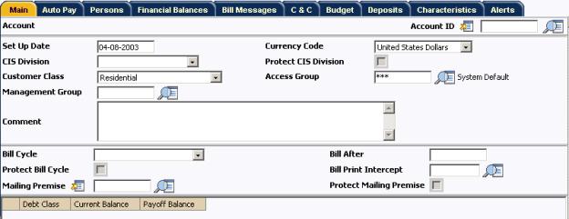
Empty Maintenance Page
To search for an existing Account, you have two options:
· Type in the unique ID of the account (in Account ID) and press enter.
· Just click the Go Look Button to cause the account search page to appear.
The following is an example of the search page that appears when you click the Account Go Look Button.
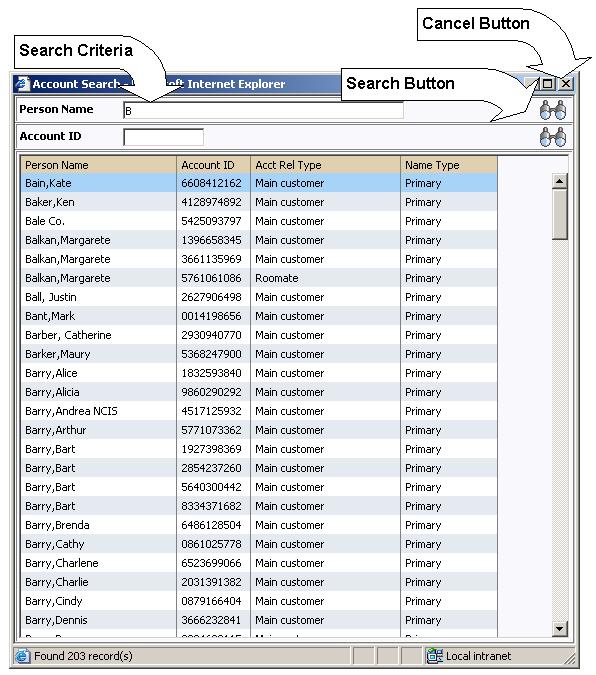
Search Page
From the search page, you have the following options:
·
Enter Search Criteria and click the adjacent Search
Button  .
.
· You can select a specific item by clicking the desired item. You can also use the up and down arrow keys (or Tab and Shift+Tab) to highlight the item you want, then press Enter to select it. After selecting an item, you can use the Previous Item Button and the Next Item Button to display the previous and next items in the list.
· You can cancel the search by clicking the Cancel button. This causes the search page to disappear and the original maintenance page to become active.
If you select an item, the search page disappears and the original page is populated with the selected item.
Search results grids are limited to a pre-defined number of rows. The number is large, typically set at 300 or more. If your search conditions results in more than the limit you will need to refine your search criteria. The Get More function is not available in search grids.
Wild cards
Most searches do NOT support wild cards as this can result in degradation of performance.
The Refresh Button
Click the Refresh button to refresh the values on the page with those held on the database. Note, all unsaved changes will be discarded.
The Clear Button
Click the Clear Button to clear the contents of the input fields (in preparation of adding a new object).
The Save Button
Click the Save Button to save the object on the database. If the object in the page already exists on the database, it will be Changed to reflect the contents of the page. If the object in your page is new, clicking the save button will Add it to the database.
The Delete Button
Click the Delete Button to remove the object from the database. Note, the delete button is only visible if the object can be deleted (many objects cannot be deleted).
Before an object is deleted, the delete confirmation window appears giving you one last chance to abort before physically deleting the object from the database. Once an object has been deleted, it cannot be restored (i.e., there is no undo after a delete).
The Duplicate Button
Click the Duplicate Button to create a duplicate of the object.
The duplicate button is only visible if the object can be duplicated.
Confirmation & Error Messages
Whenever a database modification action is requested, the system first validates the data to be put on the database.
First, the system validates the information. If there are errors, the first error encountered is displayed in a window. In addition to the error message, the error window also contains the error number and the identities of the programs that detected the error. If you don’t understand an error and you have to call product support, please supply them with this information.
If there are no errors, the system is modified.
Additional Information Page
Some maintenance pages contain Push Buttons that, when clicked, cause specific logic to execute. For example, on the bill segment maintenance page, push buttons exist to Generate a Bill Segment, Freeze a Bill Segment, Cancel/Rebill a Bill Segment, etc.
Depending on the type of logic associated with the push button, additional information may be needed before the logic can execute. For example, if you want to Cancel/Rebill a Bill Segment, you must supply the cancel reason (and several other values) before the cancel/rebill takes place.
If additional information is needed, a page appears (that resembles a pop-up window). We refer to these pages as “Additional Information Pages”. The following is an example of the additional information page that appears when you click the cancel/rebill button on the bill segment page:
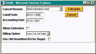
In order to proceed with the rebill logic, you must fill in the required fields and click the Calculate button. If you do not wish to continue with the requested action, you may click the Cancel.
Warning If Unsaved Changes Messages
If you make any changes to an object and you don’t commit these changes to the database, the following warning page will appear:
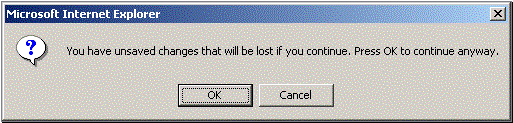
If you made a mistake and want to commit the changes, click Cancel. If you really want to lose your changes and transfer to the new page, click OK.
Warning! This warning is not displayed if you are working on a NEW object and you navigate to a different page. Information about new objects is preserved in memory in anticipation of your return to the page. For example, if you are in the middle of adding a new user and you want to quickly reference information on a different page, you will not receive the above warning because your information will be saved. If you use the back button to return to the user page, all of the information you were adding will be present and you can enter the rest of the new user’s data.
Query pages are used to display record sets in the system. Most query pages function in a similar manner. This section focuses on functionality common to all of the system’s query pages.
Contents
How Query Pages Open
Query pages open as a result of the following actions:
· The selection of a menu item (either from a Menu Bar or from a Context Menu Button).
· Drill down using a Go To Button.
Regardless of how the page is opened, the end result is the same—a new page appears:
Query Page
The Search Area
The upper right corner of the screen is almost always the identifier of the object associated with the search. In the above example, the unique identifier is the Account ID as this is the Account Financial History page.
To the right of the unique identifier is a Go Look Button. This button is used to search for a different object than the one whose data is being displayed in the page.
If the object being displayed has an associated context menu, a Context Menu Button is displayed.
This section describes certain types of portals provided in the system where a user may control the content. Good examples of these types of portals are those used by most of us when we setup Excite, Yahoo, MSNBC, etc. for our own personal use. For example, in Yahoo, we can indicate we want our portal to show our stock portfolio, the news headlines, and the local weather.
For more information about portal pages used for base product query and maintenance pages, refer to Portals and Zones Common to Base Product Pages.
In most base products, there are several pages whose content can be customized by individual users. These portal pages exist because different users have different data requirements. For example, in Oracle Utilities Customer Care and Billing a billing clerk might prefer the customer information portal to show a customer's bills and payments. However, a credit and collection supervisor might prefer the same page to show an account’s collection activity. Portal pages allow each user to define what they want to see.
The contents of this section provide background information about portals.
Contents
Each User Can Customize Which Zones Appear
Users Must Be Granted Security Access To Each Zone
Zones May Appear Collapsed When A Page Opens
Portals Are Made Up Of Zones
We use the term “zone” to describe a section on a portal page. For example, the following is a portal page with five zones:
· Context
· Customer Information
· Financial Information
· Alerts
· Bill Graph
The following example may not be available in your application; it is used for illustration purposes only.
Refer to the portals and zones chapter for each product in the Business Process Guide for a description of the user controlled content portals and zones available in a product.
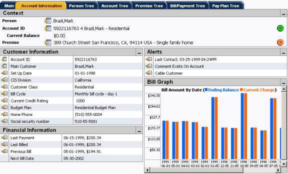
A Portal Page Showing Five Zones
Each User Can Customize Which Zones Appear
Each user has control over the following:
· Which zones appear on their portal pages
· The order in which the zones appear
· Whether the zones should be “collapsed” (i.e., minimized) when the portal page opens.
Users define their preferences by clicking the User Preferences button. Pressing this button transfers the user to the User Preferences page on which their Portal Preferences can be defined.
Recommendation. We strongly recommend that you set your preferences to collapse those zones that you don’t need every time a new account / person / premise is selected. Why? Because we don’t perform the processing necessary to build collapsed zones until you ask to expand a zone. Opening the zones collapsed accelerates the response times of portal pages.
Users Must Be Granted Security Access To Each Zone
An application service is associated with each zone. A user must be granted access rights to the respective application service in order to see a zone on a portal page.
Refer to The Big Picture of Application Security for information about granting users access rights to an application service.
Please note the following in respect of how application security impacts a user’s zones:
· A user’s Portal Preferences page contains a row for every zone on every portal page regardless of whether the user has access rights to the zone. Because of this, the system displays an indication of the user’s access rights to each zone.
· If a user’s access rights to a zone are revoked, the zone will be suppressed when the user navigates to the respective portal page.
· Revoking a user’s access rights does not change the user’s Portal Preferences (i.e., a user can indicate they want to see a zone even if they don’t have access to the zone – such a zone just won’t appear when the respective portal page appears).
Zones May Appear Collapsed When A Page Opens
When a user defines their Portal Preferences, s/he can indicate that they’d liked
a zone to be collapsed (i.e., minimized) when a portal page appears. A user might want to do this if s/he doesn’t
want to take up space on the page, but wants the data easily available. To view the information in a collapsed zone,
the user can press the zone’s  button.
Recommendation. We strongly recommend that preferences be set up to collapse zones that aren't needed every time a new account / person / premise is selected. Why? Because we don’t perform the processing necessary to build collapsed zones until a user asks to expand a zone. In other words, indicating a zone is collapsed improves response times.
Dashboard Portal
The dashboard is a portal that always appears on the desktop. Its zones contain tools and data that are useful regardless of the object being displayed.
Minimize the dashboard. You can minimize the dashboard by clicking on the dashboard heading. This causes the dashboard portal to disappear allowing more of the page area to display. A vertical dashboard bar is then displayed on the right side of the page. Clicking the dashboard bar restores the display of the dashboard portal. Rather than clicking, you may press Alt-J to toggle the display of the dashboard.
The contents of this section describe the zones that are available on this portal.
Additional zones may be available in other products. The zones described below are available in every base product. Please refer to the product-specific documentation for additional dashboard zones available in your product (open the help and navigate to the index entry labeled Dashboard).
Contents
Current To Do Zone
The Current To Do zone is designed to streamline the process of working on To Do entries from assignment to completion. It displays key information about the user's current To Do entry and provides functions that help minimize the number of steps it takes to resolve the entry and potentially other entries related to it.
Users may have the option to click on the  icon to request the next To Do entry they
should work on. This functionality is
optional and can be configured to follow your organization's business rules in
determining the next task for a user.
For example, if your organization practices work distribution "on
demand", this feature can be configured to find the highest priority entry
a user can work on and assign it to the user.
Refer to work distribution
for more information on this business practice.
icon to request the next To Do entry they
should work on. This functionality is
optional and can be configured to follow your organization's business rules in
determining the next task for a user.
For example, if your organization practices work distribution "on
demand", this feature can be configured to find the highest priority entry
a user can work on and assign it to the user.
Refer to work distribution
for more information on this business practice.
Next Assignment Rules Are In A Plug-in. Refer to Next Assignment Algorithm for more information on how to configure the system to take advantage of this function.
If the system is successful in determining the next entry the user should work on, this entry becomes the user's current To Do and its information is displayed on the zone. Note that using the next assignment icon is only one way of setting the user's current To Do. Regardless of how an entry became the User's current To Do its information is displayed in the zone.
Refer to A User's Current To Do to better understand the notion of a current To Do and the various ways it can be set.
The Message describes why the entry exists. The message description allows the userto drill into the page on which the entry’s respective object is displayed. For example, if the entry is associated with a bill segment that’s in error, the user is brought to the bill segment page to correct the error. If the To Do type has been configured to associate a script with this To Do entry’s message number, then instead of being taken to the respective page, the associated script is launched.
Info displays the standard To Do information. An  icon appears if there are comments on the To
Do and an
icon appears if there are comments on the To
Do and an  icon appears if there is a log entry of type Forwarded, Sent Back or User Details on the To
Do. The description drills into the To Do entry page allowing the user to
view more information about the entry or make changes to it as needed.
icon appears if there is a log entry of type Forwarded, Sent Back or User Details on the To
Do. The description drills into the To Do entry page allowing the user to
view more information about the entry or make changes to it as needed.
If the To Do entry has non-complete related entries a summary Related To Do description appears. The description states the total number of related entries, how many are still in Open, how many are assigned to current user and how many assigned to others. This hyperlink navigates to the To Do Search query allowing the user to review the related entries. At this point the user may decide to assign entries that can be positively identified as being caused by the same problem as the current To Do also to himself.
After resolving the problem indicated in the current entry's message the user could use the Complete All button to complete in one step the current entry and all its truly related entries assigned to the current user.
Alternatively, the user may opt to use the Complete button to complete the current entry alone and work on related entries one at a time. Using the related To Do information hyperlink the user may navigate to the To Do search page and drill into the first related To Do to work on using the message hyperlink. This entry now becomes the user's current To Do and the Next To Do and Previous To Do action buttons are set to scroll through the related entries list.
Eligible Scripts Zone
The business process assistant allows you to set up scripts that step a user through your business processes. On a script, you can define eligibility rules that define the types of customers and / or users to which the script is applicable. By defining eligibility rules, you can avoid presenting the user with scripts that aren’t applicable to the current customer or the user’s role. For example, you can indicate a script is only applicable if the account’s customer class is residential and the user belongs to the "level 1 customer service representatives" group.
The Eligible Scripts Zone highlights all scripts that are applicable for the current customer and / or user. You can click on a script to execute it.
Securing scripts. Only scripts the user is allowed to execute are displayed. Refer to Securing Script Execution for more information.
Favorite Links Zone
Each line in the Favorite Links Zone corresponds with one of the user’s favorite links (i.e., transactions). Clicking on a line invokes the transaction. A number appears adjacent to the first nine entries to highlight that these links can be invoked by pressing an accelerator key (Ctrl+a number). Note, the numeric keypad on your keyboard cannot be used to implement this function.
Users define their favorite links by clicking the User Preferences button. Clicking this button transfers the user to the User Preferences page on which their Favorite Links can be defined.
To Do Summary Zone
The To Do Summary Zone has several purposes:
· It presents a summary of the To Do entries that have been assigned to you. Note, only To Do entries that are Being Worked On that have been assigned to you are summarized in this zone.
· The colorful “age bars” highlight the age of the To Do entries. The colors red, yellow and green are used to highlight the relative number of old, middle-aged and new To Do entries. The age associated with each of these colors is user-configurable. Note, you can hover the cursor over an “age bar” to see the number of To Do entries.
· If you click on the To Do Type description or on an “age bar”, you’ll be transferred to the To Do List transaction where these To Do entries will be displayed. From this page, you can drill down to the specific entries.
Time saver! After
you drill down on entry from the To Do
List page, you can use the Previous
To Doand Next To Dobuttons in
the action bar allow you to scroll through additional To Do list entries
without returning to the To Do List For Type page.
Switch Language Zone
The Switch Language zone is used to switch the application's language. Only languages that are supported by your implementation will appear.
To switch the application's language, choose the desired language and press the Refresh button.
If your implementation uses a single language. If your implementation uses a single language, you should suppress this zone by not granting security rights to the zone's application service.
Work List Zone
The Work List zone provides quick access to an entire column of an info or query zone. When a user clicks on a work list entry, the system will do whatever it would have done if they'd clicked on the hyperlink in the zone. In addition, the system ticks off that they've worked on the entry (this feature is mostly so users know that they've at least looked at something). Refer to Work Lists to better understand how to configure query columns to support work lists.
The My Preferences window and the User Maintenance transactions are the same except that with My Preferences, only the following items can be modified:
· Main Page
· Language Code
· Display Profile ID
· To Do Summary Age Bar Parameters
· Portal Preferences Page
· All information can be modified
· Favorite Links
· All information can be modified
· Favorite Scripts
· All information can be modified
Contents
User - Main
Select Main Menu, My Preferences to define basic information about a user.
Click a button to access this information. Rather than use the menu, you can click the  button (My Preferences) located in the action
area to access your information.
button (My Preferences) located in the action
area to access your information.
You can also access this page from Admin, Users. If you access this page from the Admin menu, you can define all information about a user.
Description of Page
Enter a unique User ID, Last Name and First Name for the user. These fields are only available if you accessed the page from the Admin menu.
Use Language Code to define the language in which the user’s screen prompts and messages should appear.
The next group of fields is used if you dictate some of a user’s preferences. For example, you can setup portal preferences on a “template user” and then indicate that specific users should inherit their portal preferences from the “template user”. By doing this, you force these users to share the same portal preferences (meaning the account information and dashboard zones will be consistent for these users). The following points describe how to use these fields:
Set User Type to Template User for the user whose preferences will be used by other users. This field is only available if you accessed the page from the Admin menu.
If a user’s portal preferences should be inherited from a “template user”, use Portals Profile User ID to define the user ID of the template user. If this field is specified, the specific user will not be able to customize their portal preferences (they inherit their preferences from the Portals Profile User ID). This field is only available if you accessed the page from the Admin menu.
If a user’s favorite links should be inherited from a template user, use Favorites Profile User ID to define the user ID of the template user. If this field is specified, the specific user will not be able to customize their favorites (they inherit their preferences from the Favorites Profile User ID). This field is only available if you accessed the page from the Admin menu.
Use Display Profile ID to define the display options for this user.
Use Email ID to define the user’s email address. Currently, the system does not make use of this field. It exists in case your implementation needs to create email for a user.
Use Dashboard Width to define the number of pixels to use for the dashboard. If you have a monitor capable of displaying 1024 * 768 pixels, we recommend setting this to a value of 200 (meaning that 200 out of 1024 pixels will be used by the dashboard). If your display supports more information, you should consider increasing this value as per your preferences.
Use Home Page to define the page that is displayed when the user clicks the Home Page Button. This page is also the first page a user sees when they start the system.
When you are using Oracle Utilities Customer Care and Billing product, the fields Tender Source and Display All Premises are also displayed.
· Use Tender Source to define the notional location (e.g., the specific cash drawer) in which an user's payment tenders are stored during the day. The payment event transaction defaults this value when a user adds a new payment event. This field is only available if you accessed the page through the Admin menu.
Please refer to the Oracle Utilities Customer Care and Billing payments documentation for additional information. (Open the help and navigate to the index entry labeled Payment Event - Tenders).
· Use Display All Premises to define the value defaulted onto Control Central - Main when you initially log in to the system. If you change the value on Control Central after logging in, the system will use the changed value throughout your session. The next time you log in to the system, the default value defined on this page will again be used by Control Central.
Please refer to the Oracle Utilities Customer Care and Billing control central documentation for additional information. (Open the help and navigate to the index entry labeled Control Central - Main).
Use the User Group collection to define the user group(s) to which this user belongs (users have access to the application services linked to their user group(s)). If the user is no longer part of a user group, use Expiration Date to define the date when the user is no longer part of the respective User Group. This grid is only available if you accessed the page from the Admin menu. Refer to The Big Picture Of Application Security for more information.
You can also maintain the users in a user group using User Group - Users.
User - To Do Roles
Select Admin Menu, User and navigate to the To Do Roles tab to define the To Do roles to which the user belongs. You cannot modify this page if you accessed it through My Preferences.
A user’s To Do roles control the types of To Do entries the user can access. Refer to To Do Entries Reference A Role for information about To Do roles.
Description of Page
The grid contains the user’s To Do roles. To modify a To Do role linked to the user, simply move to a field and change its value. To remove a To Do role, click the - button. To add a new To Do role, click the + button and enter the role.
Where Used
Every To Do entry references a role. A To Do role has one or more users (and a user may belong to many To Do roles). Users who are part of the To Do role assigned to a To Do entry may work on the To Do entry. Refer to The Big Picture Of To Do Lists for more information.
User - Access Security
Select Admin Menu, User and navigate to the Access Security tab to define a user’s security rights. You cannot modify this page if you accessed it through My Preferences.
Refer to The Big Picture of Application Security for more information about data access roles and access groups.
Description of Page
Use the Default Access Group to define the access group that is defaulted on new records added by this user that are subject to row security.
The scroll area contains the Data Access Roles to which this user belongs. A user’s data access roles play a part in determining the accounts whose data they can access. Refer to Access Groups, Data Access Roles and Users for more information.
To add additional data access roles to this user, click the + button and specify the following:
Enter the Data Access Role. Keep in mind that when you add a Data Access Role to a User, you are granting this user access to all of the accounts linked to the data access role’s access groups.
Use Expiration Date to define when the user’s membership in this data access role expires.
Note. You can also use Data Access Role - Main to maintain a data access role’s users.
The tree highlights the Access Groups to which the above Data Access Roles provide access.
User - Portal Preferences
The base product contains several customizable portal pages. Portal preferences allow users to control:
· Which zones appear on the portal pages
· The order in which the zones appear
· Whether the zones should be “collapsed” (i.e., minimized) when the portal page opens.
You may not be able to change your portal preferences. If a noteappears immediately before the list of portal pages, a system administrator has configured your user ID to reference a Portals Profile User ID (this is defined on the Main tab). Preferences set in this way cannot be modified. System administrators do this in order to enforce a common look-and-feel throughout the user community.
The following methods can be used to open this page:
· Open Admin Menu, User and navigate to the Portal Preferences tab to modify any user’s preferences.
· Open Main Menu, My Preferences to modify your own preferences.
·
Click the  button (My Preferences) located in the action area.
Description of Page
The accordion contains a row for every portal to which you have access. To change how a portal's zones appear, expand the respective row and change the elements accordingly. The remainder of this section describes how you can configure how a portal's zones appear.
Zone lists all of the zones in the portal.
Place a check under Display if the zoneshould be displayed on the portal page.
Place a check under Initially Collapsed if the zone should be minimized when the portal page is initially opened. Setting zones as initially collapsed is a good idea to save space and to help pages to load more quickly. Refer to Zones May Appear Collapsed When A Page Opens for more information.
Use Sequence to control the position of the zone in respect of the other zones. This field is disabled if Display is not checked. Duplicate Sequence numbers are allowed.
Security Access indicates whether the user has access rights to a zone. Refer to Granting Access To Zones for more information.
User - Favorite Links
This page is used to define a user’s favorite transactions and URL's. Each such link appears as an entry in the Favorite Links Zone. This zone appears in your Dashboard.
CTRL + a number can be used to execute a favorite link. Rather than clicking a button in the favorite links zone, you can invoke your first 9 favorite links by pressing CTRL + a number (where the number corresponds with the relative position of the transaction in your list of favorites). Note well, the numeric keypad on your keyboard cannot be used to implement this function.
The following methods can be used to open this page:
· Open Admin Menu, User and navigate to the Favorite Links tab to modify any user’s preferences.
·
Open Main Menu, My Preferences
to modify your own preferences. Note,
rather than use the menu, you can click the  button (My Preferences) located in the action
area to access this information.
button (My Preferences) located in the action
area to access this information.
Description of Page
You may not be able to change your favorite links. If a Notebeneath your User ID, your user id has been setup to reference a Favorites Profile User ID (this is defined on the Main tab). If a system administrator has setup your user ID like this, this user’s preferences appear below and may not be changed. System administrators do this in order to enforce a common look-and-feel throughout the user community.
Each row references a Navigation Option. The navigation options supplied with the base package correspond with the system's menu items. This means you can setup a favorite link to open any transaction in the system (in either add or update mode).
Favorite links can point to other places. The navigation options supplied with the base package always open a transaction's Main tab. If you find yourself continually accessing a different tab page, you can have your implementation team create a new navigation option that references the desired tab page. Once this navigation option is set up, you can reference it as one of your favorite links. In addition, it's also possible for your implementation team to setup navigation options that open a URL outside of the system. For example, your implementation team could setup a navigation option to a credit rating company's website. Once this navigation option is set up, you can reference it as one of your favorite links.
Use the Sequence to control the order in which the navigation option appears in the Favorite Links Zone.
Security Access indicates if you have been given security rights to the respective transaction. Refer to The Big Picture Of Application Security for more information.
User - Favorite Scripts
This page is used to define a user’s favorite scripts. Each script is displayed in the favorite scripts area of the business process assistant menu.
CTRL + SHIFT + a number can be used to execute a favorite script. Rather than selecting a script from the business process assistant, you can invoke your first 9 favorite scripts by pressing CTRL + SHIFT + a number (where the number corresponds with the relative position of the script in your list of favorites). For example, if you press CTRL+SHIFT+2 and you’ve setup your “favorite scripts” to be Start autopay and Stop receiving marketing information; the Stop receiving marketing information script is executed. Note well, the numeric keypad on your keyboard cannot be used to implement this function.
The following methods can be used to open this page:
· Open Admin Menu, User and navigate to the Favorite Scripts tab to modify any user’s preferences.
·
Open Main Menu,
My Preferences to modify your own preferences. Note, rather than use the menu, you can click the button (My Preferences) located in the action
area to access this information.
Description of Page
You may not be able to change your favorite scripts. If a Note is displayed on top of the grid, your user ID has been setup to reference a Favorites Profile User ID (this is defined on the Main tab). If a system administrator has setup your user ID like this, this user’s preferences are displayed below and cannot be changed. System administrators do this in order to enforce a common look-and-feel throughout the user community.
Each row in the grid contains one of your favorite Scripts.
Use the Sort Sequence to control the order in which the scripts appear in the business process assistant menu.
Security Access indicates whether you have access to the script’s application service. Refer to The Big Picture Of Application Security for more information.
User - Characteristics
Select Admin Menu, User and navigate to the Characteristics tab to define characteristic values for the user. You cannot modify this page if you accessed it through My Preferences.
Description of Page
Use the characteristicsgrid to capture additional information about the user.
You can only choose Characteristic Types defined as permissible for the user record. Refer to Setting Up Characteristic Types & Their Values for more information.
Enter a valid Characteristic Value for the selected characteristic type. You may enter more than one characteristic row for the same characteristic type, each associated with a unique Sequence number. If not specified, the system defaults it to the next sequence number for the characteristic type.
User - User Portal
Select Admin Menu, User and navigate to the User Portal tab to view additional information associated with a user.
General Information
User Id, First Name and Last Name are displayed.
Depending on your implementations requirements, you may define additional zones to appear on the User Portal
Refer to The Big Picture of Portals and Zones for a description of portal and zone functionality.
Your implementation team can set up business process assistant (BPA) scripts to walk you through business processes. Once scripts have been set up, you can initiate a script using any of the following methods:
· You can define a list of your “favorite scripts” on your user preferences. You can then invoke any of your first 9 favorites by pressing CTRL + SHIFT + a number (where the number corresponds with the relative position of the script in your list of favorites). For example, if you press CTRL+SHIFT+2 and you’ve setup your “favorite scripts” to be Start Autopay and Stop sending marketing information; the Stop receiving marketing information script is invoked. Note well, the numeric keypad on your keyboard cannot be used to implement this function.
· You can configure a menu item to launch a script by referencing a navigation option that is a script navigation option type.
· The system creates To Do entries to highlight tasks that require attention (e.g., bills in errors, accounts without bill cycles, etc.). Users can complete many of these tasks without assistance. However, you can set up the system to automatically launch a script when a user selects a To Do entry. For example, consider a To Do entry that highlights a bill that's in error due to an invalid mailing address. You can set up the system to execute a script when this To Do entry is selected. This script might prompt the user to first correct the customer's default mailing address and then re-complete the bill. Refer to Executing A Script When A To Do Is Launched for more information.
· You can indicate that a script should be launched upon entering the system. This functionality enables an external system to launch the system and immediately launch a script.
· If you click the Business Process Assistant Button in the button bar (or by pressing Ctrl+Shift+S), an interactive menu is displayed:
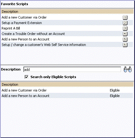
BPA Scripts Menu
The top of this interactive menu shows your favorite scripts (i.e., you define these on your user preferences). A number appears adjacent to the first nine entries to highlight that these scripts can be invoked by pressing an accelerator key (Ctrl+Shift+a number). Note, the numeric keypad on your keyboard cannot be used to implement the accelerator function.
The bottom half of the interactive menu allows you to search for a script using any word in its description. Note, if you’ve turned on Search only Eligible Scripts, your search is limited to eligible scripts. Note, the system displays an indication if each script in the grid is Eligible or Ineligible in this section.
You can initiate a script from either of these areas by clicking on it.
When a script is initiated, this menu closes and the object display area shifts down to make room for the script area.
Securing scripts. Only scripts the user is allowed to execute are displayed. Refer to Securing Script Execution for more information.
Note. The BPA Button in the button bar “glows” while a script executes. If you hover the mouse pointer over the glowing BPA button, a tool tip containing the name of the script appears.
Customize the script area. Using the Height step type, an individual script may be configured to use more or less of the script area than the standard script area. It is also possible to configure a script to hide the script area altogether.
The information in the script area takes you through the steps in the selected business process (note, your implementation team controls the information that appears in the script area).
The following points highlight useful information common to all scripts:
· Return focus to script area. Often during a script the focus moves from the script area to another section of the page. For example, you might be required to fill in data for a new record being added. When you are ready to return to the script area, rather than using the mouse to return to the area, you can press Ctrl+Shift+F. The focus returns you to either the first available input field or to a “default” button if no input field is available.
· The Continue button. Many steps in a script ask you to click the Continue button when you’re ready to restart a script. For example, a step may ask you to confirm a customer’s automatic payment information and then click Continue when you’re ready for the script to restart. Rather than using the mouse to click this button, you can press Ctrl+Shift+C.
· Selected button changes color. When you click a button in the script area, the button selected changes color so that you can easily see which option you selected.
Refer to The Big Picture Of Scripts for more information about scripts.
Note. You can abort a script at any time by clicking the red X button in the upper right corner of the script area (or by pressing Ctrl+Shift+X).
The following table summarizes the accelerator keys available in the system:
|
Accelerator Key |
Function |
|
Alt-B |
Returns to the previous page on which you were working. This is the equivalent of clicking on the Back Button. |
|
Alt-C |
Clears the currently displayed object from the page. This is the equivalent of clicking on the Clear Button. |
|
Alt-D |
Creates a duplicate of the object being displayed. This is the equivalent of clicking on the Duplicate Button. |
|
Alt-G |
Returns to the original page that was displayed when the Back Button was clicked This is the equivalent of clicking on the Forward Button. |
|
Alt-I |
Transfers you to Control Central - Account Information page. This is the equivalent of clicking on the Account Information Button. This accelerator key is only available if you are using Oracle Utilities Customer Care and Billing product. |
|
Alt-J |
Causes the dashboard to be minimized. |
|
Alt-K |
Transfers you to To Do Entry - Main for the current To Do in the To Do list. If you press Alt-K while on the To Do List page, you are taken to the first To Do Entry on the list. This is the equivalent of clicking on the Current To Do Button. |
|
Alt-L |
Transfers you to Control Central - Account Information page and clears the search criteria. This is the equivalent of clicking on the Control Central Search Button. This accelerator key is only available if you are using Oracle Utilities Customer Care and Billing product. |
|
Alt-M |
Presents a list of menu choices. This is the equivalent of clicking on the Menu Button. |
|
Alt-N |
Causes the next entry in the search results to be displayed. This is the equivalent of clicking on the Next Item Button. |
|
Alt-O |
Transfer you to your home page. Your home page is defined on your User Preferences. This is the equivalent of clicking on the Home Page Button. |
|
Alt-P |
Causes the previous entry in the search results to be displayed. This is the equivalent of clicking on the Previous Item Button. |
|
Alt-Q |
Causes the next customer in the “call waiting” queue to be displayed on Control Central - Account Information page. This is the equivalent of clicking on the Next Call Button. This accelerator key is only available if you are using Oracle Utilities Customer Care and Billing product. |
|
Alt-R |
Refreshes the page with the last saved version of the object being displayed in the page. This is the equivalent of clicking on the Refresh Button. |
|
Alt-S |
Saves any changes that you’ve made on the database. This is the equivalent of clicking on the Save Button. |
|
Alt-U |
Causes the menu bar to open if it is closed. If the menu bar is open, pressing this key causes it to close. |
|
Alt-X |
Transfers you to To Do Summary. This is the equivalent of clicking on the To Do List Button. |
|
Alt-Y |
Causes the previous item in the To Do list to be displayed. This is the equivalent of clicking on the Previous To Do Button. |
|
Alt-Z |
Causes the next item in the To Do list to be displayed. This is the equivalent of clicking on the Next To Do Button. |
|
Alt-Insert |
Inserts a new row into an Editable
Grid if the insertion point is in the grid. This is the equivalent of clicking the |
|
Alt-Delete |
Removes a row from an Editable
Grid if the insertion point is in the grid. This is the equivalent of clicking the |
|
Alt-F1 |
Invokes the application help manual. This is the equivalent of clicking on the Help Button. |
|
Alt-1 through Alt-9 |
These keys are only applicable when a Notebook appears. When pressed, the tab page whose relative position corresponds with the number appears. For example, if you press ALT-3 on a page with multiple tabs, the 3rd tab will be displayed. If there are more than 9 tabs on a page, you must use the mouse or F2 / Shift-F2 to display a tab. Note well, the numeric keypad on your keyboard cannot be used to implement this function. |
|
Ctrl-1 through Ctrl-9 |
Invokes the favorite link whose relative position corresponds with the number. For example, if you press CTRL-3, the transaction for your third “favorite link” will be invoked. Note well, the numeric keypad on your keyboard cannot be used to implement this function. |
|
Ctrl-Shift-C |
If the current step in the Script area has a Continue button, this is the equivalent of clicking the Continue button in the script area. |
|
Ctrl-Shift-F |
If the Script area is open and you are currently working on a different area of the page, this key returns focus to the script area. The focus returns you to either the first available input field or to a “default” button if no input field is available. |
|
Ctrl-Shift-S |
Opens the business process assistant where you can select a script that walks you through a business process. This is the equivalent of clicking on the Business Process Assistant Button. |
|
Ctrl-Shift-X |
If the Script area is open, this is the equivalent of clicking the close button in the script area. |
|
Ctrl-Shift-1 through Ctrl-Shift-9 |
Invokes the favorite script whose relative position corresponds with the number. For example, if you press CTRL-SHIFT-2 and you’ve setup your “favorite scripts” to be Start Autopay and Stop sending marketing information; the Stop receiving marketing information script is invoked. Note well, the numeric keypad on your keyboard cannot be used to implement this function. |
|
Alt-left arrow |
Populates a scroll area with the
previous entry. This is the
equivalent of clicking the |
|
Alt-right arrow |
Populates a scroll area with the
next entry. This is the equivalent of
clicking the |
|
Press Enter when in a field with an adjacent “go look” button |
Causes the search to be invoked. This is the equivalent of clicking on the Go Look Button. |
|
Press Enter when in a field with an adjacent “search” button |
Causes the search to be invoked. This is the equivalent of clicking on the Search Button. |
|
Press Enter when a row in a search result grid is highlighted |
Causes the item to be selected (and the search to close). Note, after selecting an item from the search results, you can press ALT-N and ALT-P to scroll up and down through the other items in the search result grid without returning to the search results. |
|
Press Enter when a menu item is highlighted |
Causes the menu item to be selected. |
|
Press Enter when the insertion point is within a tree node |
This is the equivalent of clicking on the item in the tree: · If the insertion point is on a node image, the node will either expand or collapse (dependant on the current state of the node). · If the insertion point is on a context menu, the context menu will be opened and normal menu processing will apply. · If the insertion point is on a “link” element, the normal navigation processing will take place. |
|
Press Tab when a row in a search result is highlighted |
Causes the next row to be highlighted. |
|
Press Space when the insertion point is on a button |
Causes the respective button to be pressed. |
|
Press Space when the insertion point is in a date / time field |
Causes the date / time selection window to open. |
|
Press Space when the insertion point is in a check box |
Causes the check box to toggle between checked and unchecked. |
|
Press Page Up while in a list grid |
Causes the contents of the list grid to scroll up approximately one page. |
|
Press Page Down while in a list grid |
Causes the contents of the list grid to scroll down approximately one page. |
|
Use up / down Arrow keys when in a drop down |
Causes the content of the dropdown to scroll to the next / previous value in the dropdown list. Note, you can also press a letter to cause the dropdown to reposition to the next value that starts with this letter. |
|
Use up / down Arrow keys when in search results |
Causes the next / previous row in the search results to be highlighted. |
|
Use up / down / left / right Arrow keys when in a menu |
Causes the related menu item to be highlighted. |
|
F2 |
Causes the next tab page to appear (when a Notebook appears on the page). |
|
Shift-F2 |
Causes the previous tab page to appear (when a Notebook appears on the page). |